![]()
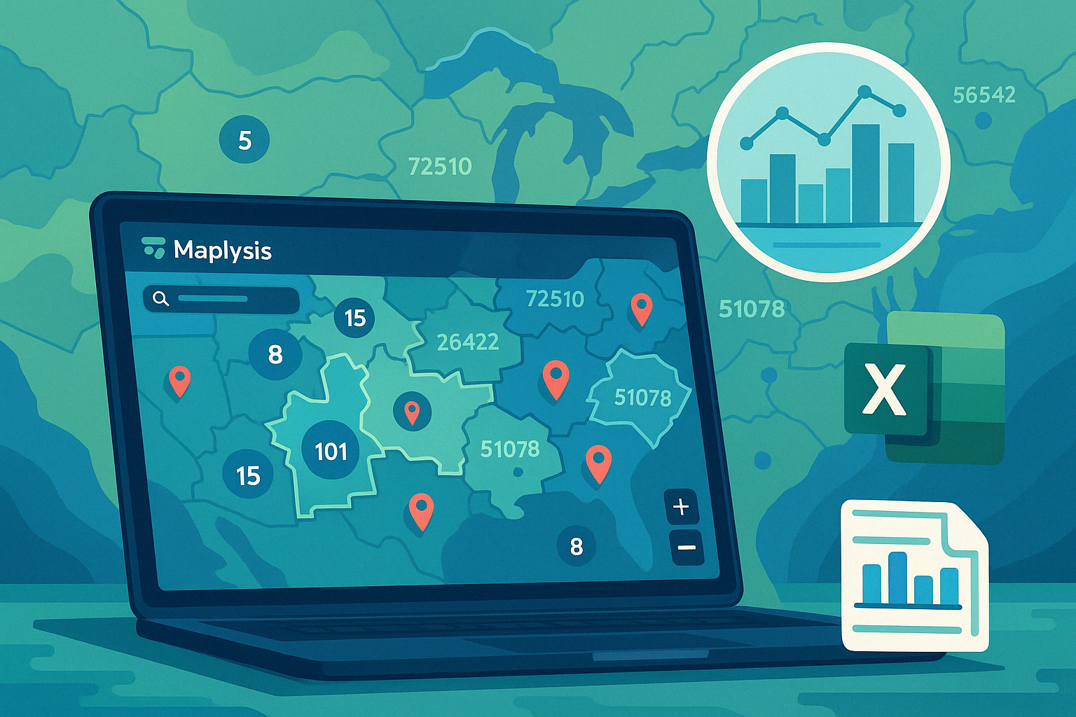
Have you ever wished you could see the world—one zip code at a time—to make smarter decisions on where to focus your efforts? Maplysis turns raw geo data into actionable insights, helping you target the right areas with ease.
Project Overview
Maplysis is a user-friendly web app built to analyze location-based datasets, applying a K‑nearest‑neighbor–like algorithm to identify and visualize optimal target zones on an interactive map.
Real-World Scenario
Picture an NGO that wants to run medical camps across a region. They have zip codes and patient counts but need to know where to set up for maximum impact.
With Maplysis, they can:
- Upload an Excel/CSV file of zip codes and patient data.
- Choose a radius (e.g., 10 miles) and a minimum patient threshold for eligibility.
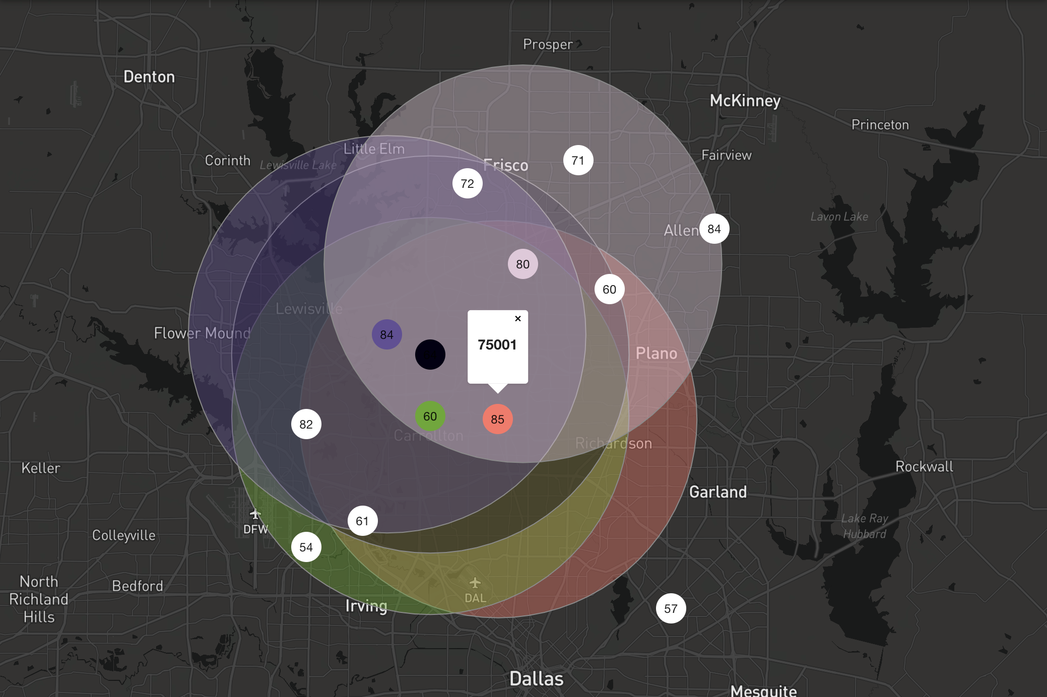
- See target zip codes highlighted on the map, covering the highest patient densities.
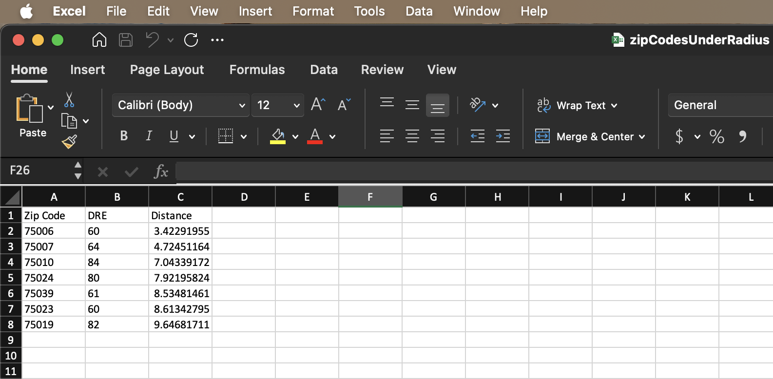
After generation, the app produces a downloadable report showing each selected zip code, its patient count, and average distance to neighbors—perfect for data-driven planning.
How It Works
- Data Input: Drag and drop your Excel or CSV file into the upload panel.
- Parameter Selection: Set the search radius and minimum patient count.
- Algorithm Execution: Maplysis applies a proximity-based clustering algorithm to identify key zones.
- Interactive Map: View colored markers and radius overlays on an embedded Google Map.
- Report Download: Export an Excel file listing selected zip codes and related metrics.
Key Features
- 🗺️ Real-Time Map Visualization: Instant display of target zones with intuitive markers and overlays.
- ⚙️ Parameter Control: Easily tweak radius and patient thresholds to refine results.
- 📊 Data Export: Download detailed Excel reports for stakeholder presentations.
- 📂 File Flexibility: Supports both CSV and Excel formats for seamless data handling.
- 🎨 Clean UI: Built with React and Material UI for an accessible, attractive interface.
Impact and Benefits
Using Maplysis, organizations can:
- Optimize Resources: Focus efforts on high-impact areas, reducing time and cost.
- Improve Outreach: Increase camp attendance by targeting zones with the highest patient concentration.
- Simplify Analysis: Replace manual calculations with a one-click solution.
Technical Highlights
- Frontend: React, Material UI for responsive design.
- Mapping: Google Maps API powers the interactive map components.
- Algorithm: Custom K‑nearest‑neighbor–style clustering implemented in JavaScript.
- Deployment: Hosted on Vercel for fast global access.
Next Steps
- 🌐 Multi-Layer Data: Add support for demographic and socioeconomic overlays.
- 📱 Mobile Optimization: Enhance touch controls for tablets and smartphones.
- 🔗 API Integration: Connect with third-party data sources (e.g., census or health databases).
Try Maplysis Today
Ready to pinpoint your next target zone?
Launch Maplysis
Download a sample file to get started:
Demo Excel File